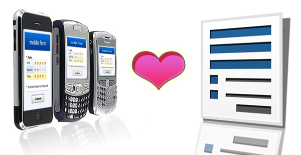
Smartphone Optimizations
Looking at our traffic from last week, we were surprised to learn that more than 6% of people accessing Formsite forms were using a mobile browser. Our forms work great on mobile browsers, but there are some tricks that can be performed to make them even better when viewed on a mobile device. With our new QR Code functionality we thought we’d help our users design forms optimized for mobile devices. We outline some tips and tricks depending on the device your users have. We break these down into three target device environments: Desktop (default), Desktop+Mobile, and Mobile-Only. Lets dive into some more detail on each of these.
Desktop (default):
There is nothing new for you to do if you anticipate a majority of your users are using a desktop or laptop computer. By default, our forms are designed for a desktop environment. If you happen to have some users accessing your forms with a mobile device, they will be able to fill them out just fine. If you are not sure if you will have mobile users or not, you might want to make the changes discussed in the Desktop+Mobile section below.
Desktop+Mobile:
If you may have some mobile users, we provide you the steps so that your mobile users see an optimized environment. We detect the type of device the user has, and if it is a mobile device we apply some special magic that does things like removes borders, shadows, makes text boxes bigger, and optimizes the form layout, etc. If your user is on a desktop computer or laptop, these changes do not apply. You just need to add some special Meta tags and CSS styles to make this happen. For more information on the steps to take to optimize for Desktop & Mobile, please see our support page.
Mobile-Only:
If you are using our new QR code feature or you know your users will mainly be mobile, you may want to design your form so that it is optimized for mobile devices. Desktop users can still complete your form, but the layout will be optimized to look great on a mobile phone. The first thing to consider about mobile phones is that their width is less than that of a typical desktop. Also, the width varies depending on whether or not the user is holding the phone in portrait or landscape mode. We have added two new width options to the Customize section of our Look & Feel page for 320 and 480 widths. So, you would choose one of these new mobile-friendly width settings and then add in the special Meta tags we outline on our support page.